Few days ago a member in Applefritter
equiped his Mimeo ( an Apple 1 rebuild ) with a plaxiglas-case
and furnished it with the logo from the former apple 1 manual.
When he published the pictures from the case in the forum at
aapplefritter i recognized that the original logo that was taken
from the manual seemed to give an impression of some kind of
"foggy" view, resulting from two points:
First of all the logo was designed for a white backgraund of the
manual-paper and therefor for contrast purpose the drawing was
carried out in darker shades....
and second the letters within the logo were shaded to the better
look-alike of a banner.... and this limited the possible
distance of clear reading to less than one yard.... ( due to the
fact that you won´t hold away the manual more than one yard ).
Due to the fact that now the logo was used on tranparent
plexiglass-case and the case was intended to be presented at the
VCF-festival ( where people pass by that case with larger
distance than 1 yard ) i assumed in the forum that it might be a
good idea to "enhance" the logo for this case.
After short exchange of the postings in the forum it seemed to
turn out, that my proposal of the "enhancing" to get rid of the
"foggy" impresion was not understood, so i took some hours to do
the "enhancement" by myself and to present the result for
comparision of both logos beside each other and thereby show the
advantage of such an enhancement.
By attempting the task to enhance the logo it was very clear to
me, that i did not want to make to large changes to the original
logo - in order to keep the idea of the artist in the former
passion. Therefor it was clear to me that i had to execute the
enhancements at the pixel-level of the logo to keep it still
with the look-alike of a copperstitch-printing like the
original.
At the other hand it was neccessary to get the background more
transparent and less "shady" for use on plexiglas - where the
main purpose of the material is to give a good view to the PCB
within the case. And respectivly to the fact the the letters
should now keep readable to a larger distance ( up to at least 2
or 3 yards away ) it was also needed to sharpen the contrast and
the borders of the letters and to reduce the shading there.
so first of all here the former
(original ) logo at the beginning before the
"enhancement" as it was printed on the manual:
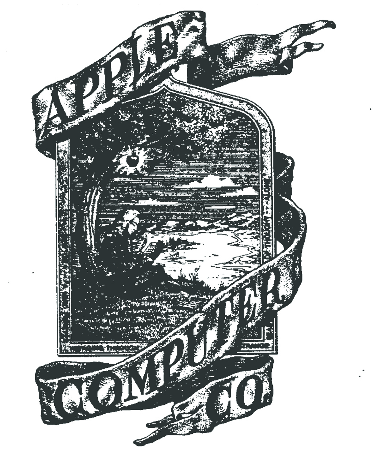
So a look at the logo
above show clearly the areas to "work-over":
1 ) scharpen the borders of the letters and remove the shades
for better reading at larger distance
2 ) lighten the background ( this affects the area of the sky -
which is rather dark in the logo with the idea to show
better contrast to the clouds - but makes the sky less
transparent and therefor less good for use on plexiglass
- but to keep the cloud within - the borders of the
clouds should be kept... )
3 ) the elements of the drawing ( Isaac Newton sitting under the
appletree with the famous apple before it drops )
have rather bad contrast ( no line to show the pocket
of the jacket, no border between tree and back of Sir Newton,
bad contrast between Sir Newtons hair, and no contrast
at his trousers... and at larger distance the apple is to small
and only recognized as a spot ( so the apple must be
enlarged slightly ) .....
so after a few hours spent in Photoshop at the pixel-level the
following result came out:
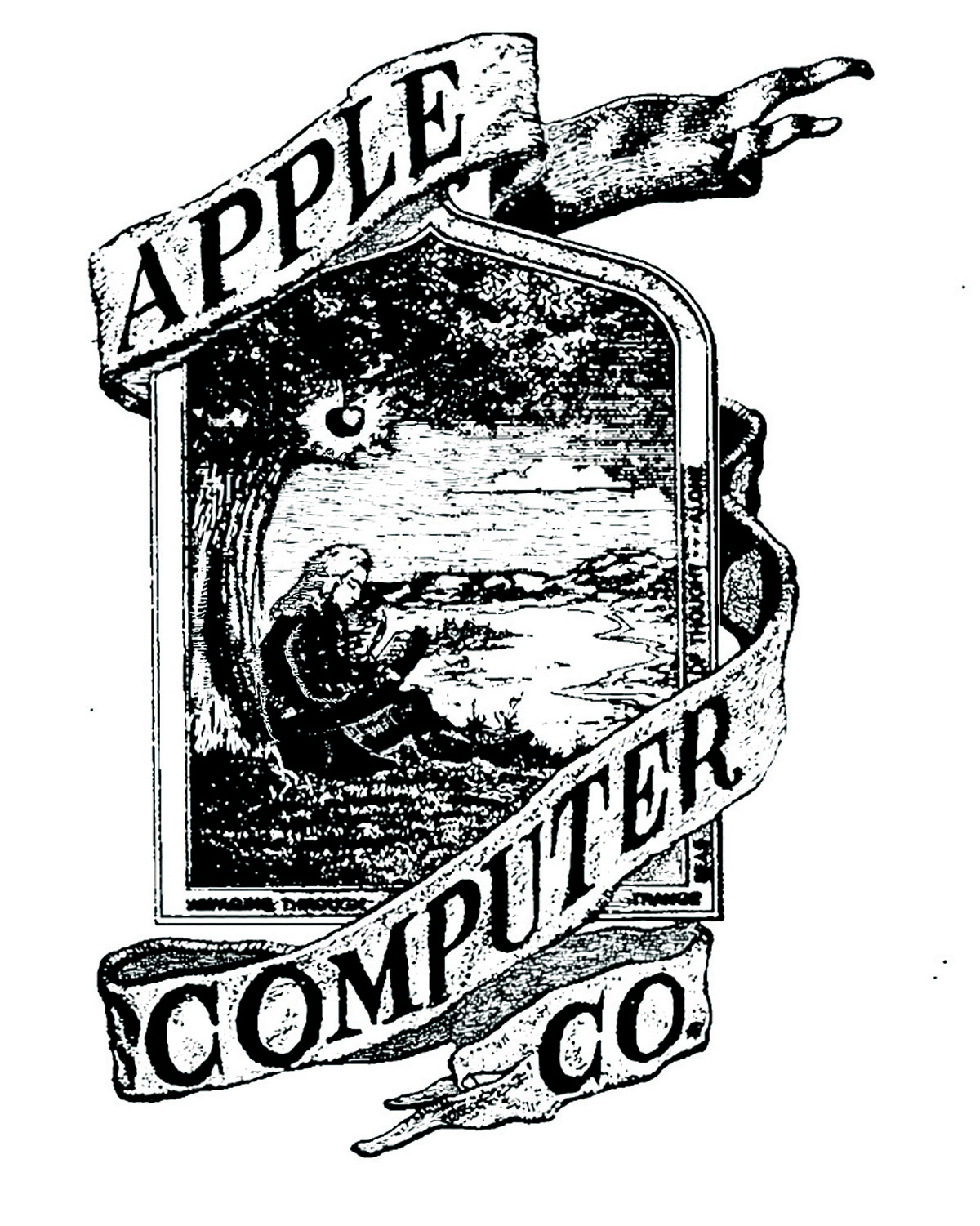
and for better comparision
here both logos just besides each other and the advice to step
back a little to compare both also at larger distance:
| the former original
logo: |
the new enhanced
logo: |
|
|
|
it´s up to the viewers
judgement if they side with my opinion that the logo made profit
from the enhancement.....
|